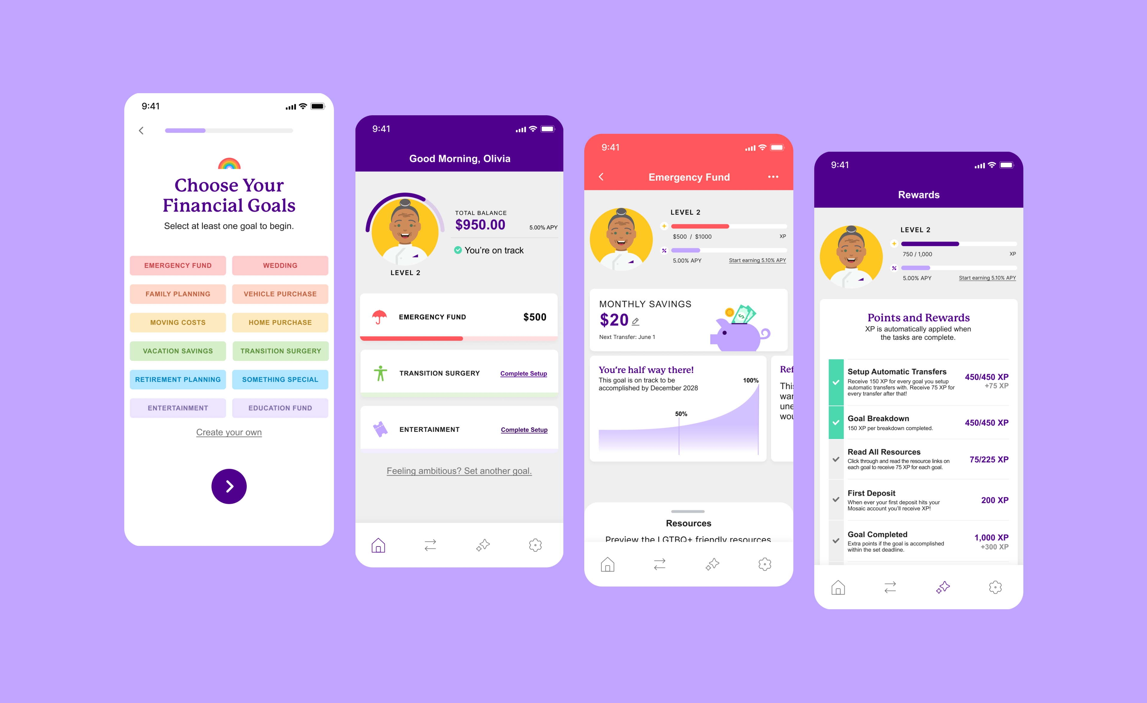
Mosaic Finance
A passion project: Designing Mosaic, a Savings App Empowering LGBTQ+ Financial Wellness
Product Design MVP
2024


Senior living is about more than just healthcare. For over 50 years, Northern California nonprofit Eskaton has championed a different path. Translated as 'dawning of a new day,' Eskaton is transitioning from a clinical model to a hospitality-led experience.
This evolution creates communities where residents don't just receive care, they find belonging and pursue new passions. Our recent brand refresh bridges this 50-year legacy with a modern, lifestyle-forward vision for the future.

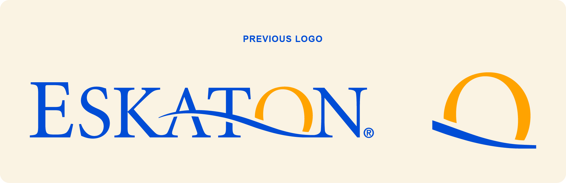
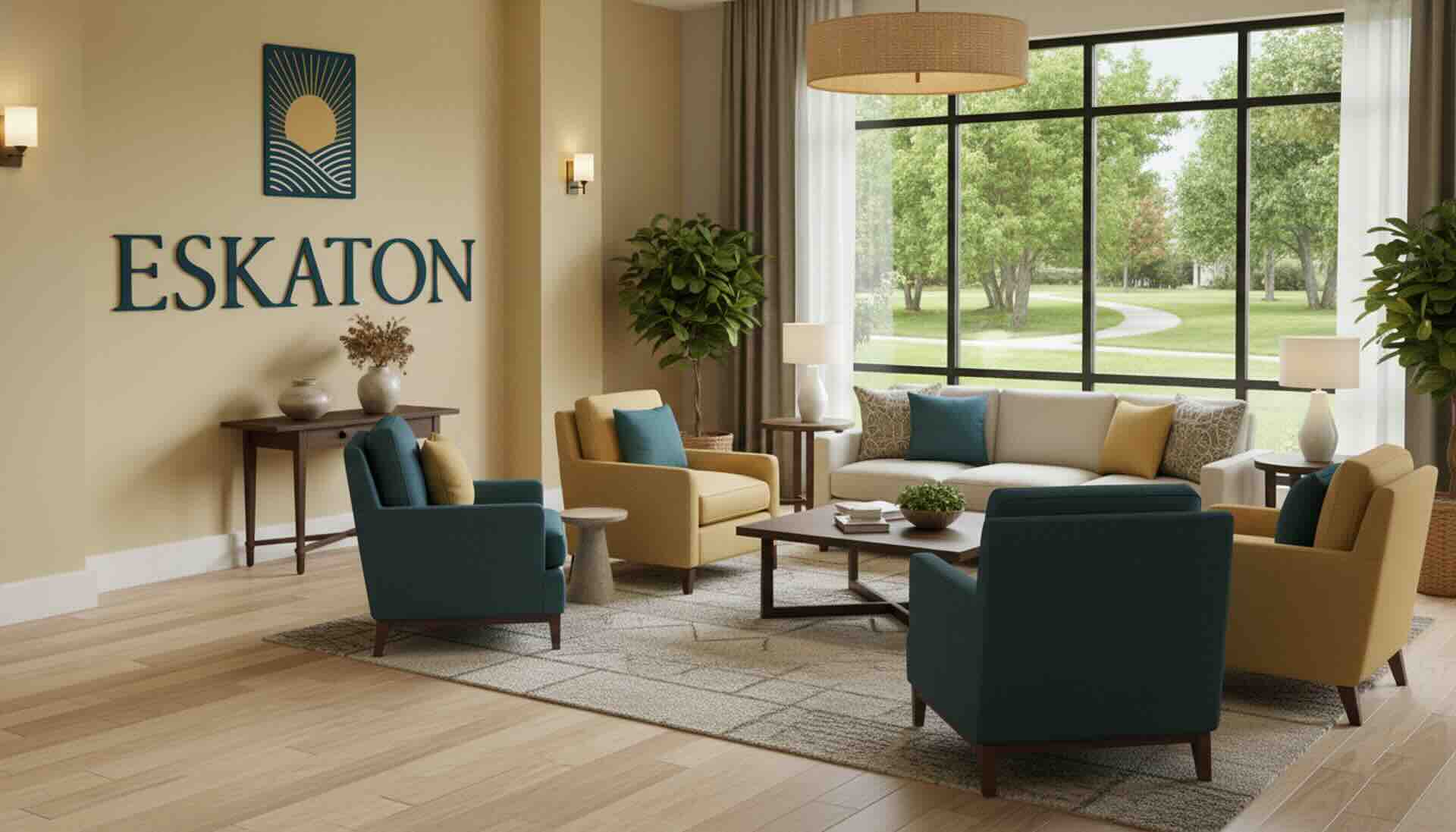
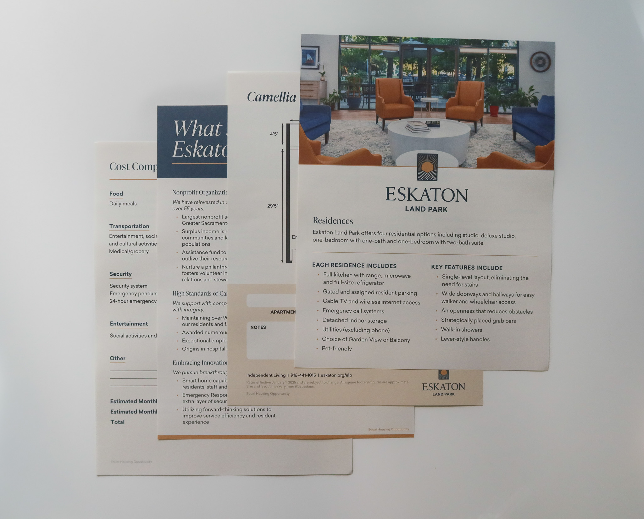
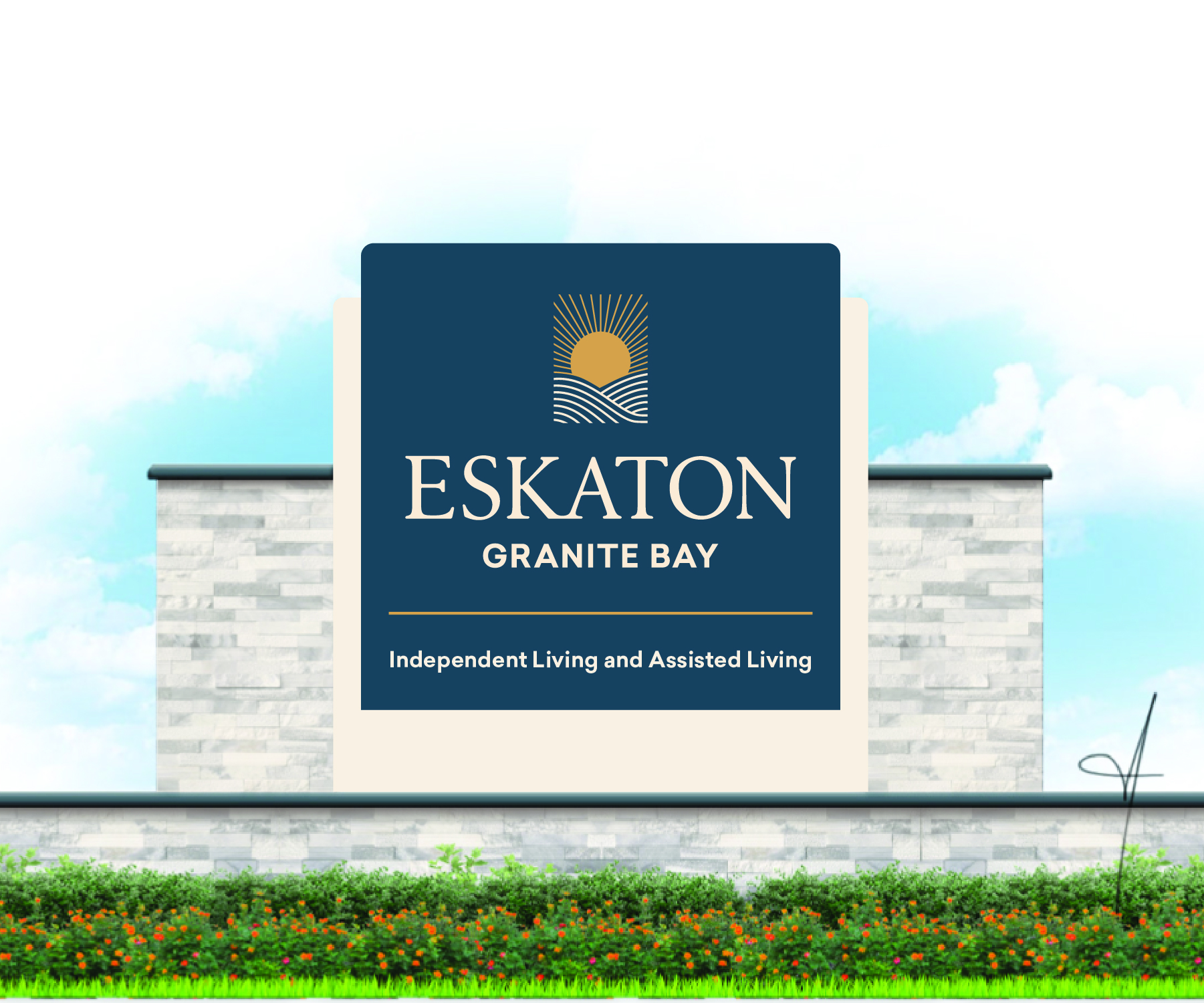
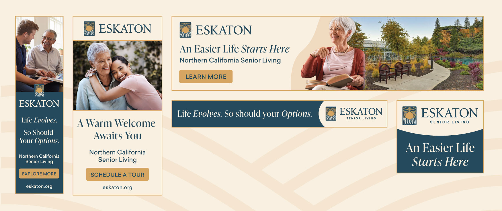
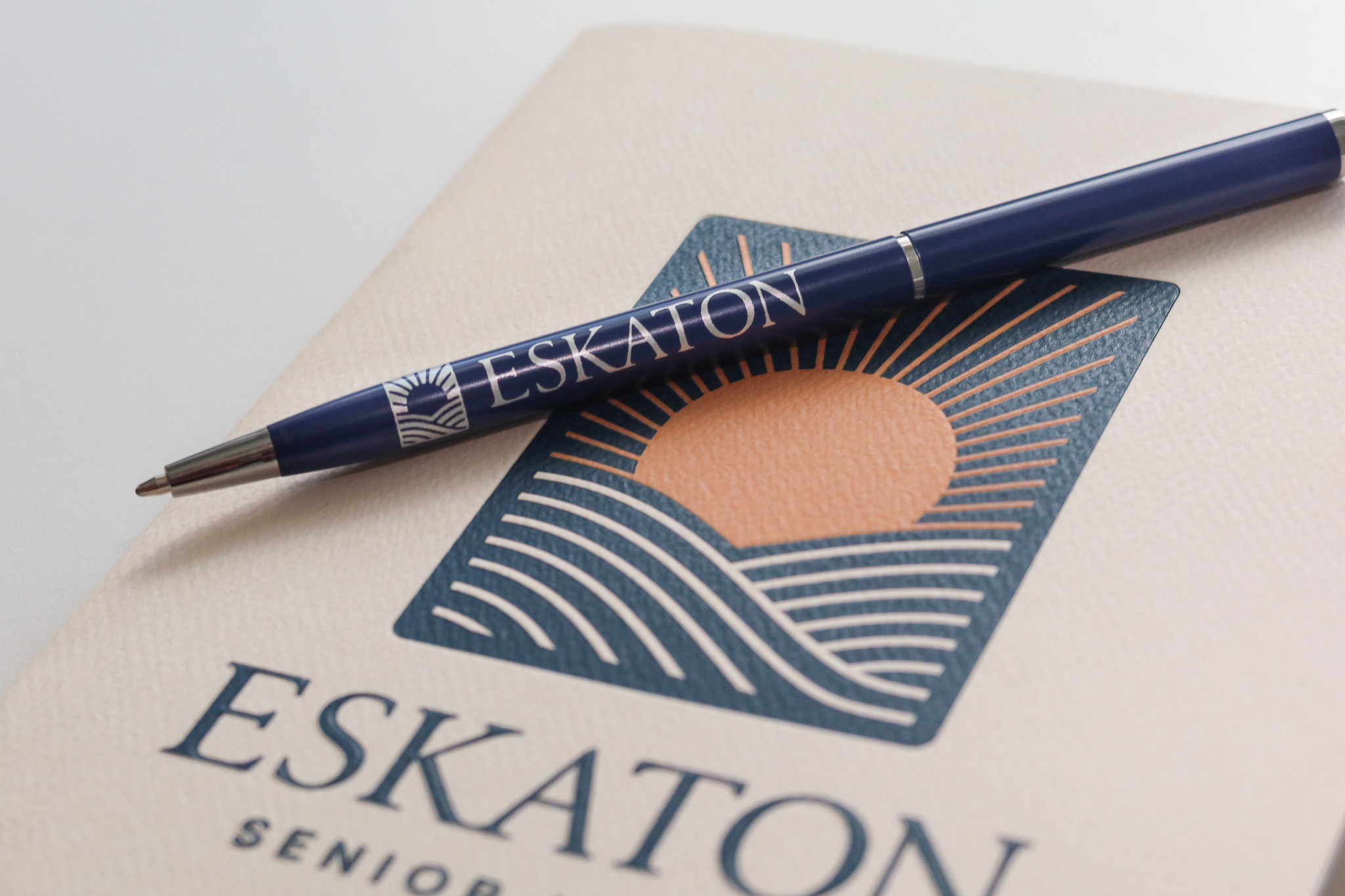
The brand refresh marked a literal “dawning” for Eskaton, intertwining a vibrant, hospitality-led lifestyle with its long-standing legacy of care. My primary contributions focused on designing the new logo and visual identity, evolving the original mark rather than replacing it. By allowing the iconic sun to rise over the hills once more, I introduced a renewed symbol of optimism that honors Eskaton’s heritage while casting a brighter light on its future.
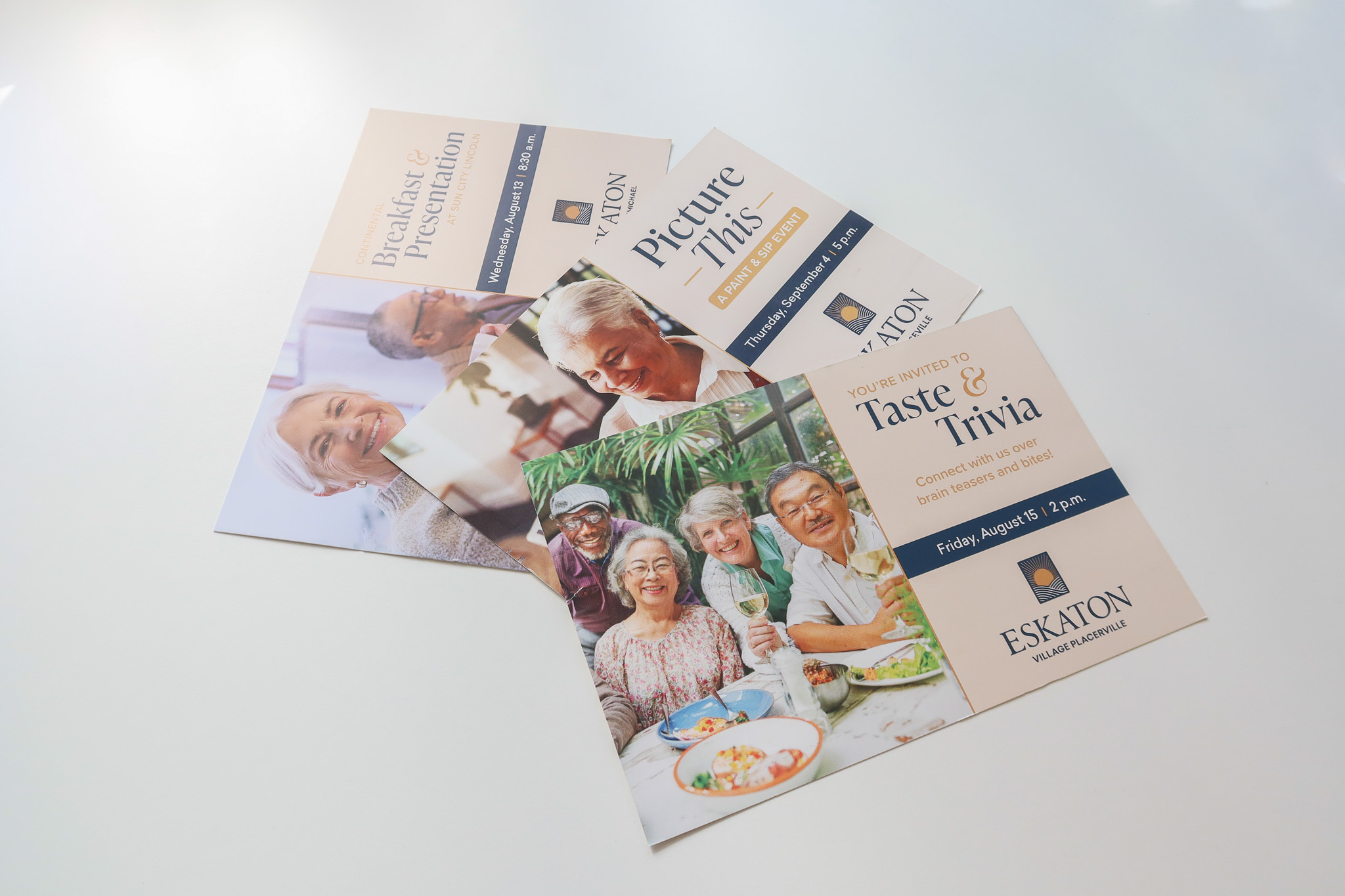
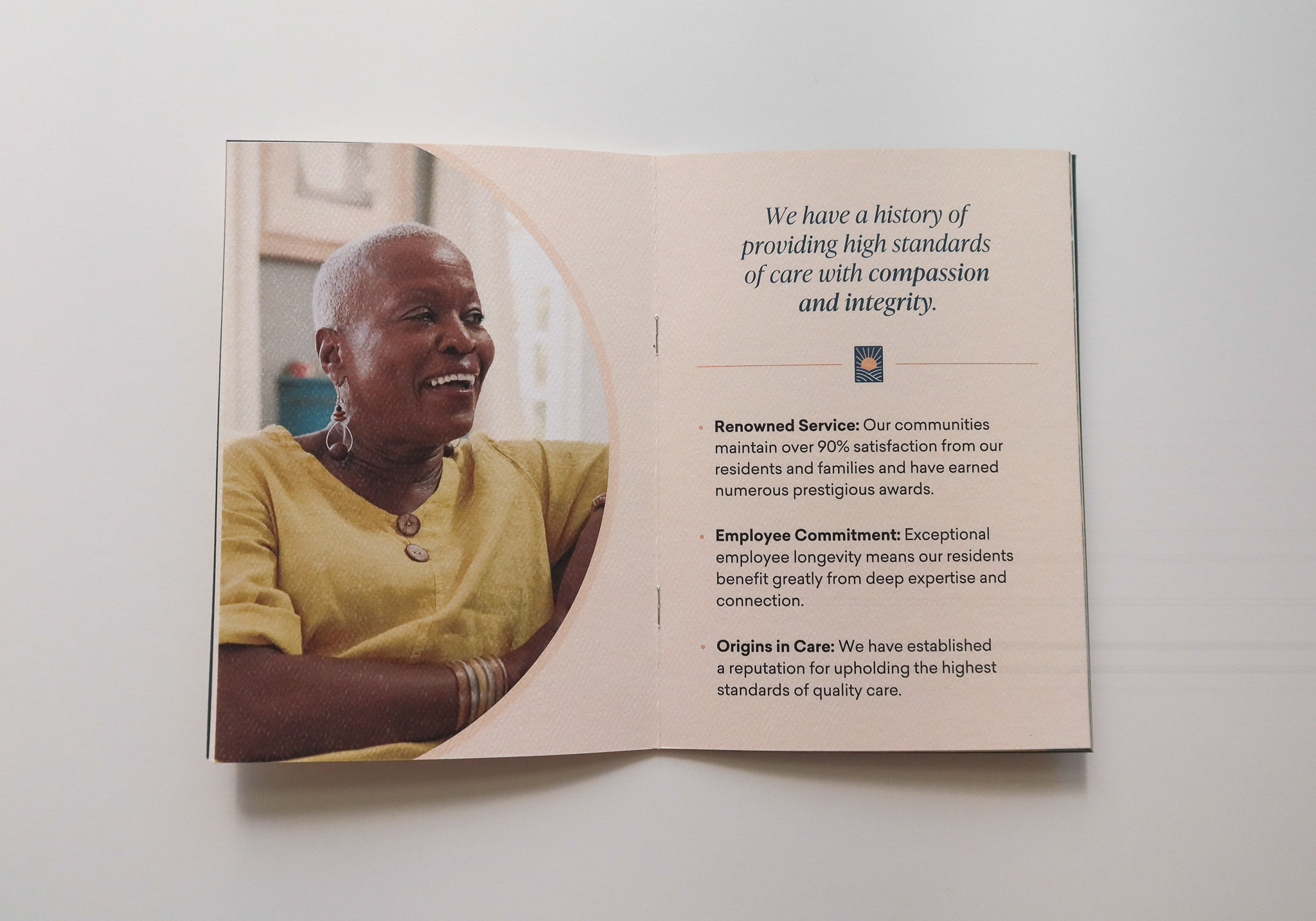
My design approach prioritized authenticity and warmth through organic, tactile elements that reflect Eskaton’s belief in transparent and human-centered care. The refreshed identity uses natural textures, subtle debossed logomarks, and refined typography to create a sensory experience that feels grounded yet contemporary. These visual updates helped reposition Eskaton as a modern leader in senior living while celebrating its enduring place in the Northern California community.
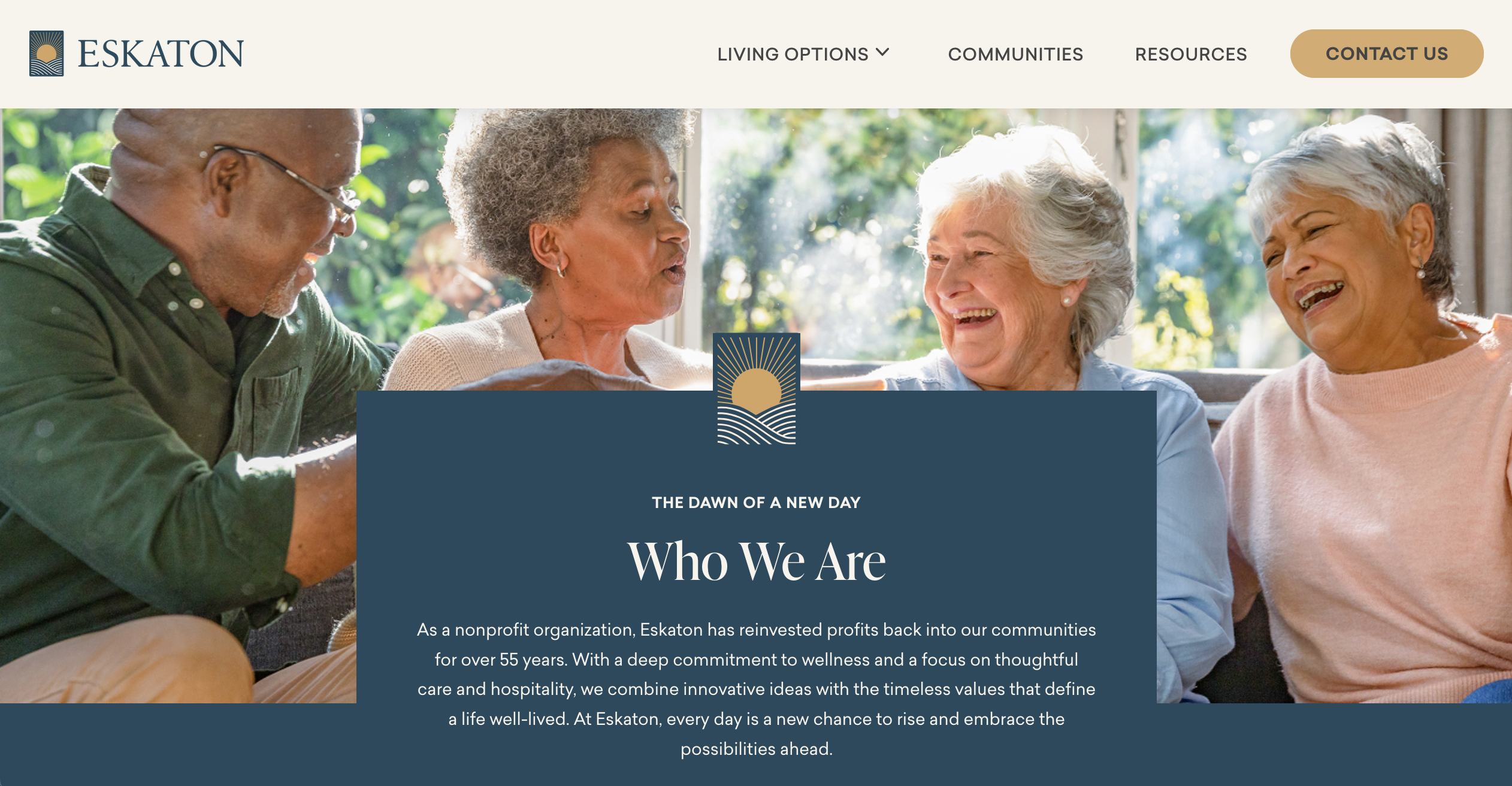
In addition to leading the visual identity, I also supported the redesign of Eskaton’s website. I collaborated with the development agency to transition the platform from Drupal to WordPress, and helped refine the user experience throughout the build process. I also ensured the design system remained consistent across all digital touchpoints, reinforcing Eskaton’s refreshed brand language online.